Planbox UX Usability App Review

The key to a perfect app is how valuable it is. Value is based on a number of different traits such as usability, desirability and credibility. Without usefulness, either, an app has no real value.
Planbox is an app that allows users to create initiatives in order to keep track of work within a company and it is a free download on the app store.
Applications nowadays need to have seamless integration of services with their functions. Right off the bat, I realize that Planbox does not.

Users are taken out of the experience of the app by having to go to their website to register. An app is supposed to envelop all of your time if done correctly, so small things like registration should really be done within the app to ensure that they are being used. Some people may see this and never open the app again after getting distracted once going on the internet.
The good news here is that sign-up for their free trial is a cinch. Simply enter your email, name, password and organization and you're in. Then you can finally use the app.
After inputting your username and password you're brought to a rather bland homepage with few options or direction. In the middle you have an area to receive a tutorial on Planbox, on the top right you have a dashboard that limits your movement to your profile or feedback about the app.
I will say that as this point, moving around the app hasn't been a struggle. They don't hide buttons in small print or pictures, everything seems clickable and nothing is misleading.
Moving to the tutorial part of the app, it jumps off the page more as a game than something meant to teach you how to use it. Each “How To” task has between 1 and 8 milestones that you can achieve. There are positives and negatives to this set-up.
The positive coming out of this being that it gives the user a clear look at what needs to be accomplished for them to really understand everything that's going on within this app. Too many times have apps tried to hide everything inside a compact app, while Planbox lays it out on the table.
The downside to this is the short attention span of human beings in the modern era. One look at this table full of 'to-do's' and milestones and they may shy away from the app. The app, as said earlier, is meant to inviting and consume time of the consumer. Giving them too much on their plate may cause a third to shy away and no one wants to lose a third of their business. Easing them in without them knowing they'll have 20+ tasks with 50+ milestones to accomplish may work better than giving it all to them at once. While these milestones are as simple as reading, it's creating something that will entice them to read, rather than force them to read, that is the goal.

After spending 10-20 minutes to complete the tutorial, you finally come to the realization that you didn't have to do that tutorial because you can't create a new initiative on the app. To be frank, how should an app score on usability if you can't use it to perform a main task? Very low. Without function, there is no desire to actually use the app. Everything can be done on the web. As their tutorial video explained, it is mainly geared towards agencies, product development companies and businesses – none of them aren't able to use a computer all the time to do work on this. This renders the app almost useless.
After being forced to step away from the app to use the app, I found myself on the Planbox website where I was easily able to find the button to create an initiative. What followed wasn't so easy.
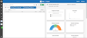
The screen they bring you up to rather is an odd amalgam of blank screen and complex gizmo's and gadget's that leave a lot to interpretation. Anyone who doesn't know what they'll use Planbox for going in won't really know going out. The tutorial only covers basic functionality within the app, not so much within the browser – which is required to use the app.
While Planbox seems credible in the fact that they know what their app provides, it doesn't seem as though much of the larger population would. Without only a small portion of the population being able to use the app, can it really be considered valuable?

When signing up on Planbox you receive a 30-day free trial that allows 2 collaborators and 2 projects. Their pricing structure is fairly cheap, though can get expensive for big corporations.
Needing 5 collaborators on one project will cost $20 a month, 10 collaborators will cost $40 a month, 15 will cost $60 a month, 30 will cost $120 a month and $50 will cost $200 a month. Anything over 50 and you are able to contact the company to get a quote.
One thing Planbox doesn't do that a lot of other apps and websites do is give you extra functions for paying more. Planbox is a taking a very direct route saying, 'here are all of our services, you pay for more users using them.' While there's nothing wrong with that, there's really no incentive to pay past 5 collaborators a month if you can somehow find a way to have 10+ people pose as 5 collaborators.


